TL;DR: Manhwa art style picks by visual strength: Painter of the Night and True Beauty for soft color, The God of High School and Weak Hero for action, and Tower of God plus Legend of the Northern Blade for detailed worlds.
Recent updates:
- October 6, 2026: Re-verified all eight listed series against AniList and official platform pages, corrected Weak Hero and Tower of God release wording, and added seven in-body links.
- October 6, 2026: Added answer-first explanations for each visual category and expanded the thinner entries with specific art and format details.
Manhwa art style is not one thing. The medium is full color by default, which separates it from manga structurally, but that alone doesn't explain why Painter of the Night and The God of High School look like they were made in different centuries. One operates in soft amber candlelight and Joseon silk. The other runs on kinetic motion lines that make the phone screen feel like it's vibrating.
The more interesting question (more interesting than "which manhwa has the best art") is what visual register a series operates in, and whether that register is doing something with the story or just filling panels. This list sorts eight series by what their manhwa art style actually does, not by a general quality score.
These series all have genuine manhwa art style merits. None are included because the art is acceptable and the storytelling does the heavy lifting. Every entry here has at least one visual quality worth reading the series for on its own terms.
Key takeaways
- Painterly / soft color: Painter of the Night, True Beauty, emotional tone carried through palette shifts and soft edge work
- Dynamic action: The God of High School, Weak Hero, energy and geometry used differently, both effective
- Detailed environments: Tower of God (later arcs), Legend of the Northern Blade, world-building through background density
- Distinctive character design: Solo Leveling, monster and dungeon design that became genre reference points; contrasted with Eleceed's expression-driven, kinetic character work
- Atmospheric horror: Sweet Home, environmental decay as a structural narrative tool
- Manhwa art style evolves within series: Tower of God in 2010 and Tower of God in 2025 are different propositions
- Full color is standard across all of these, but what varies is how each artist uses that color
What makes manhwa art style different from manga
Manhwa art style differs from manga through two linked choices: color carries meaning and the vertical scroll controls the reveal. That changes how artists handle mood, time, action, and background space. The strongest series use those constraints as storytelling tools, so the visual identity survives even when you read quickly on a phone.
Manga is mostly black and white. That's not a limitation: artists like Kentaro Miura and Takehiko Inoue built careers on what you can do with ink alone. But it does mean the entire toolkit for expressing color, mood, and time is different when you're assessing manhwa art style.
Manhwa operates in full color from the first chapter of almost every series. A manhwa art style can use a warm amber palette to signal memory, cut to cool blue for the present, and readers understand the shift without a caption. Artists can use background color saturation to show emotional states. A scene becoming slightly desaturated as a character goes numb is a visual sentence that has no equivalent in greyscale.
The vertical scroll format adds another variable. Manhwa is composed for a phone screen read top-to-bottom. The page-turn of manga (where the surprise lands at the bottom of a right-hand page) becomes a long vertical reveal. A character dropping into frame can unfold across three screen-heights of scroll. A fight sequence can extend downward until the phone screen feels like it's accelerating. Artists who understand the manhwa art style design for it. Artists who don't design pages that work in either format but excel in neither.
Both facts (full color, vertical scroll) mean that what passes for "good art" in manhwa has a different set of reference points than manga criticism developed.
For a broader view of the format's visual possibilities, the best full-color manhwa list covers more ground beyond this selection. Readers comparing historical visual language can also use Best Historical Manhwa 2026 as a wider reference.
Our best full color manhwa list showcases the most visually stunning titles with premium art.
Best Full Color Manhwa →
Overview of the manhwa art style categories
The eight picks fall into five useful visual categories: painterly color, dynamic action, environmental world-building, distinctive character design, and atmospheric horror. The categories are practical filters rather than objective awards. They tell you what to watch for in each series, which makes the list more useful than calling every polished page simply beautiful.
These eight series sit in distinct visual categories. The visual quality types are:
- Painterly / soft: Color blending, expressive faces, backgrounds that feel inhabited
- Dynamic action: Motion, force, and geometric precision in fight sequences
- Environmental / worldbuilding: Background density that does narrative work
- Distinctive character design: Memorable silhouettes and monster design
- Atmospheric horror: Environmental decay and psychological body horror
The categories are not mutually exclusive. Painter of the Night has some of the most expressive faces in manhwa regardless of manhwa art style category. But each series is listed where its most distinctive visual contribution lives.
Painterly manhwa art style: color and soft edges
Painterly manhwa art style is built from soft edges, blended palettes, and settings where light changes how fabric and faces read. Painter of the Night is the clearest example here, while True Beauty applies softer color and line variation to identity, makeup, and the difference between public and private self-presentation.
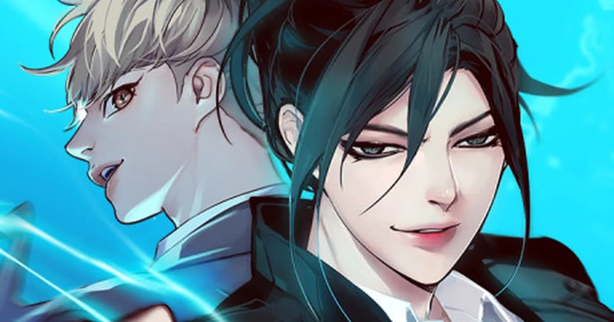
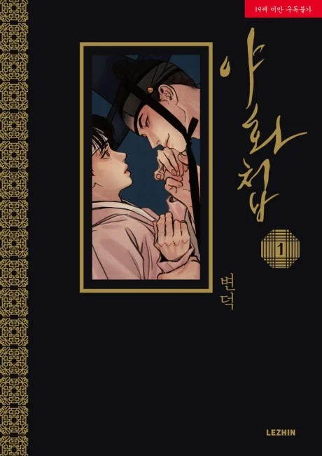 Painter of the Night cover art.
Painter of the Night
Byeonduck | Lezhin Comics | Rating: 18+ | AniList: RELEASING, with no final chapter total confirmed
Painter of the Night is the standard reference when the discussion turns to painterly color work in the manhwa art style conversation. Byeonduck's Joseon-era setting creates an unusual visual constraint: most scenes take place indoors by candlelight or in lantern-lit courtyards. That limitation becomes an asset. The warm amber-to-shadow gradients across period fabric and wooden architecture give the series a consistent visual warmth that few series in any manhwa art style achieve.
The character design is specific: expressions shift in ways that read as physically plausible rather than iconographic. Most series use a limited set of expression templates (the frozen shock face, the soft romantic gaze) because readers expect them and panels need to work at scroll speed. Byeonduck resists this. Faces in Painter carry micro-expressions that read differently depending on who you think a character is at that moment.
Costume detail is load-bearing here. The silk hierarchy of Joseon dress (who wears what fabric, in what context) is rendered precisely enough that it communicates character status before any text arrives. That's visual storytelling done by someone who understood the historical material, not someone who drew decorative clothing.
For art readers specifically: the color work in chapters 80-100 is where Byeonduck's command of the palette is fullest. Earlier chapters are good. Those chapters are the argument. Because the series is an adult BL title, this entry stays focused on its period composition, palette, and character acting rather than expanding its mature material.
If you're new to this series, the Painter of the Night reading guide covers what to expect before you start.
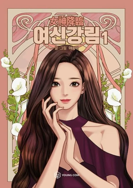 True Beauty cover art.
True Beauty
Yaongyi | WEBTOON | AniList: FINISHED, 257 chapters; WEBTOON marks the series COMPLETED
True Beauty runs on WEBTOON, built for the vertical scroll format from chapter one. Yaongyi uses this to do something most romance series don't attempt: the same character looks visually different depending on who is looking at her within the panel.
Im Jugyeong in public (careful makeup, clothes chosen to signal a particular identity) and Im Jugyeong alone or with someone she trusts occupy different color registers within the same chapter. The palette does not shift dramatically. The line work does. Public-facing scenes use cleaner outlines and more deliberate color fill. Private scenes have softer edges, less defined boundary between character and background. This happens across the full run, which AniList records at 257 chapters, with enough consistency to be a deliberate visual grammar rather than production variation.
For romance manhwa, character design consistency across a long run is genuinely difficult. Artists change. Assistants change. Stories shift tone. True Beauty maintains the visual logic of its main character across a length of run that defeats most series. That's a technical achievement worth noting separately from whether the story works for you.
True Beauty's manhwa art style also shows how the vertical format enables a specific kind of reveal: the full-body shot that lands after three close-up scroll panels. The format delay is the joke, and the artist understands it.
See manhwa like Painter of the Night for series where similar soft color and character-focused art takes a different story direction. For romance readers who want a wider range of visual approaches, Best Romance Manhwa 2026 is the broader next stop.
Dynamic action manhwa art style: force and geometry
Dynamic action manhwa art style succeeds when the reader can feel force, direction, and recovery between panels. The God of High School stretches the scroll to create momentum, while Weak Hero makes ordinary spaces and human bodies do the work. Both are action showcases, but their visual strengths reward different kinds of close reading.
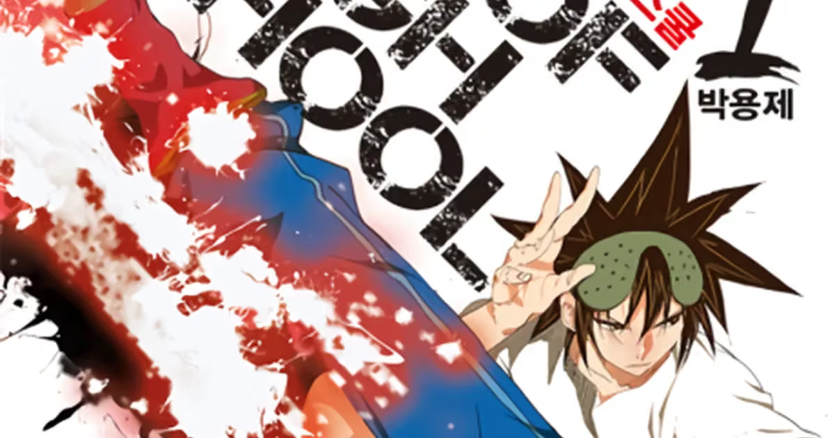
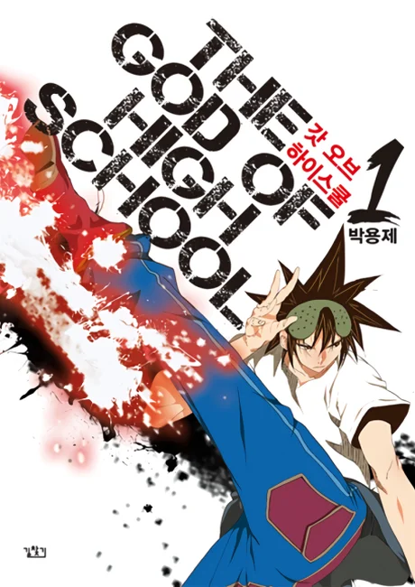 The God of High School cover art.
The God of High School
Yong-Je Park | WEBTOON | AniList: FINISHED, 569 chapters; WEBTOON marks the series COMPLETED
The God of High School on WEBTOON is the clearest argument for action composition being a specific manhwa art style skill, distinct from everything else in the medium.
Park Yongje's fight sequences use the vertical scroll as a deliberate pacing tool. A kick extends downward across what would be multiple pages in manga format, and the reader's scroll speed becomes the action's momentum. The technique that defines his panels is the follow-through frame: the panel after the impact, where the force is visible in the aftermath rather than the moment. Most manhwa shows the strike. Park Yongje consistently shows what the strike does to the person and the space around them.
The character designs in motion are the specific contribution here. At rest, the main cast of GoHS reads as fairly standard shonen design: bold outlines, spiky variation. In motion, the same characters become dynamic in ways that would not read in a static image. The manhwa art style is designed for the scroll, not the screenshot. That's rarer than it sounds.
The God of High School reading guide covers the arc structure, which matters because the action style shifts register as the power scale expands. For more technique-centered combat, Best Martial Arts Manhwa 2026 is a useful comparison.
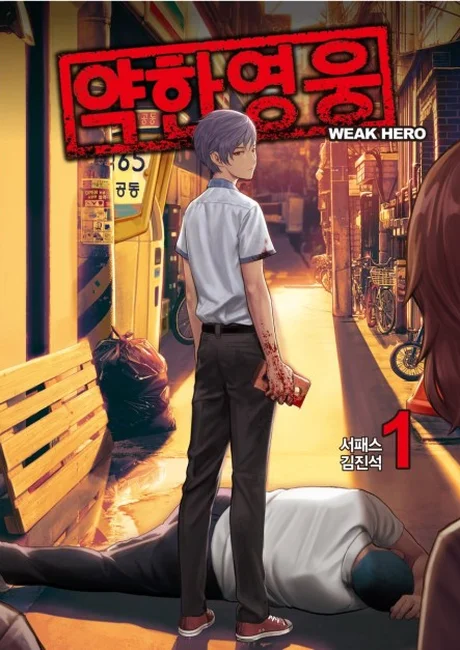 Weak Hero cover art.
Weak Hero
SEOPASS (writer) / RAZEN (art) | WEBTOON | AniList: FINISHED, 268 chapters; WEBTOON marks the series Completed
Where GoHS uses velocity and scale, Weak Hero uses geometry. The fights are grounded: no supernatural power, no energy blasts, no transformation sequences. They are fights between high school students, which means the manhwa art style has to sell impact through precision rather than spectacle.
RAZEN's fight panels work by making space legible. Before a confrontation, the artist establishes exactly where each character is relative to the others, what objects are nearby, and what the sightlines look like. This is boring to describe but visually essential. Readers understand the fight's geography before it starts, which means each panel within the sequence can be partial and still be followed.
The line weight is notably heavier in impact panels than in transition panels. This is a comics craft technique used deliberately: the variation in line weight across a single page creates visual rhythm, so impact frames literally look different from setup frames. In series where line weight is uniform throughout, impact has to be sold entirely by character expression. Weak Hero sells it through draftsmanship.
The manhwa art style here is essentially a geometry problem. RAZEN draws the space, then shows you a character moving through it with enough precision that the physics feel real without ever being stated.
For completed WEBTOON series with comparable quality across their full run, the best manhwa on WEBTOON list is the place to start. If tournament structure is the visual hook, compare the pacing with Best Manhwa Tournament Arcs.
Our master manhwa reading list covers the top 30 titles across all genres for 2026.
Best Manhwa to Read in 2026 →
Analysis: environment and world-building art
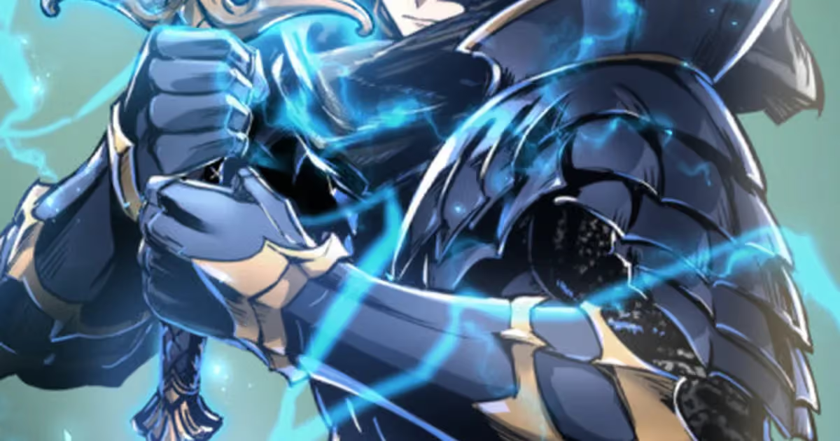
Environment-focused manhwa art style treats architecture, weather, and background density as story information. Tower of God uses changing floors to make scale and culture visible, while Legend of the Northern Blade lets worn buildings, clothing, and colder palettes track a character's movement from isolation toward agency.
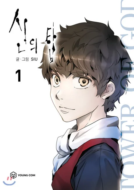 Tower of God cover art.
Tower of God
SIU | WEBTOON | AniList: RELEASING; official page lists Episode 652 as the Season 3 finale and says the series will be back
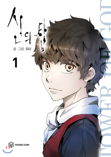
Tower of God on WEBTOON is one of the longest manhwa (Season 3 closed on episode 652 in February 2025, and the official page says the series will be back) and one of the most visually transformed across its run. The first chapters (2010) are rough. Backgrounds are sparse, character designs are inconsistent, action panels are functional but not distinguished. The manhwa art style in the opening arc is not the reason to read this series.
By the Hell Train arc (chapters 200+), SIU had developed something genuinely unusual: environmental design that communicates scale without being cluttered. The Tower's floors are not just settings. They are visual arguments for how large and strange the world is. Each new floor has a different architectural logic, a different color palette, and a different relationship between character-sized space and environment-sized space. They feel like places that existed before the characters arrived, which is an effect that's hard to manufacture.
The character design work for named antagonists in later arcs is also worth noting. Poong Baek and Kallavan are drawn with enough specificity that their design choices carry narrative weight. You can read their hierarchical position and relationship to violence from how they're drawn before any text explains it.
The recommendation here is specific: read Tower of God knowing the manhwa art style evolves dramatically, and the visual work in chapters 150-300+ is the argument for why this series belongs on any list about art.
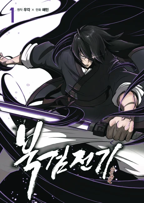 Legend of the Northern Blade cover art.
Legend of the Northern Blade
U-Gak, Hae-Min | Tappytoon | AniList: FINISHED, 202 chapters; Tappytoon marks the series Completed
Legend of the Northern Blade is a historical murim manhwa (wuxia-influenced martial arts setting in a Korean historical context) and its manhwa art style does something specific: the background detail accumulates meaning over the course of the series.
The story opens in a world that looks worn down. Architecture is visibly aged, clothing is functional rather than decorative, and the color palette leans toward earth tones and cold grays. As the protagonist gains power and the world opens up, the color range expands alongside it. The palette shifts warmer and more saturated as the story moves from survival to agency. It's not subtle, but the execution feels earned rather than programmatic.
The costume design follows the same logic as Painter of the Night: fabric and armor quality signal status before any text arrives. The distinction between Jin Mu-Won's early clothes and his later equipment is a visual character arc done entirely through the clothing designer's eye.
For completed murim manhwa with comparable attention to visual detail, the best completed manhwa list has additional entries in the same register.
Distinctive character design
Distinctive character design gives a series a visual identity you can recognize before reading the dialogue. Solo Leveling earns that recognition through monsters, bosses, and shadow silhouettes, while the article's Eleceed comparison shows how expressive movement and reactive faces can make a cast memorable in a completely different register.
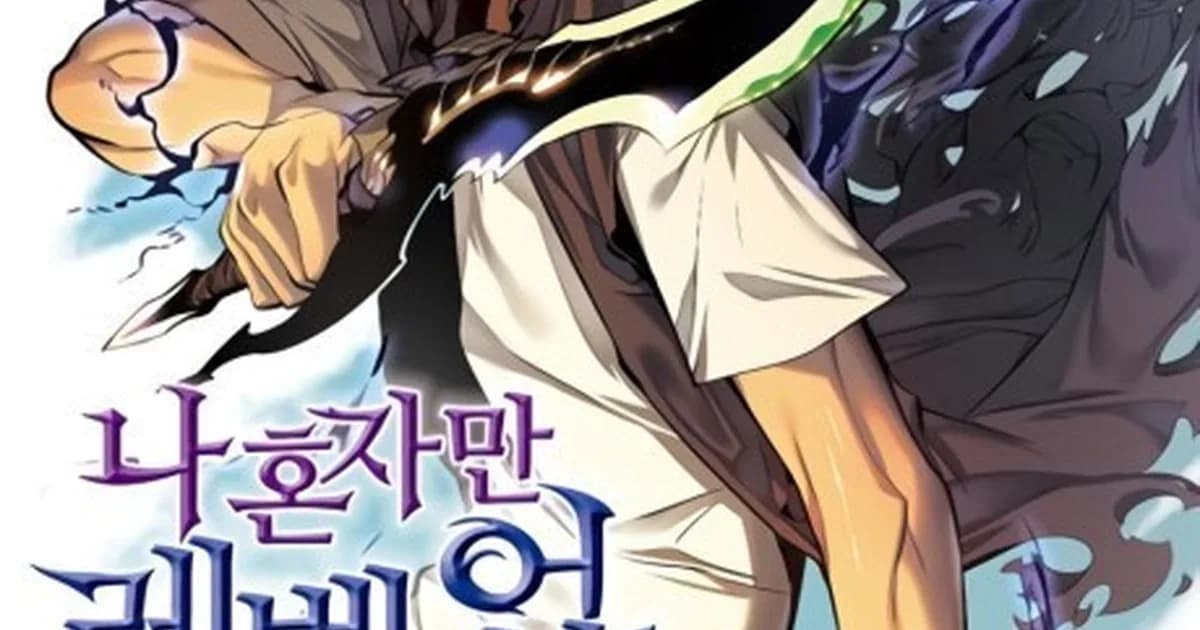
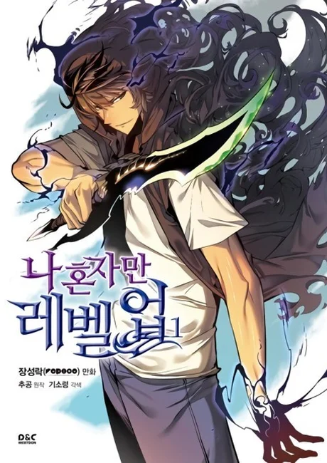 Solo Leveling cover art.
Solo Leveling
Dubu (art) / Chugong (story) | Tapas | AniList: FINISHED, 201 chapters; Tapas lists 202 episodes and marks the series Completed
Solo Leveling's manhwa art style reputation rests primarily on its monster and dungeon design, not its character work. The protagonist Sung Jin-Woo's design is functional. He looks like a male lead. The supporting cast is similarly standard. What Dubu did differently was the antagonist and creature design, which is where the manhwa art style becomes distinctive.
The Shadow Army members that appear in later arcs are visually specific enough to function as characters without dialogue. The boss designs in the A-rank and S-rank gates are not just power-scaled versions of standard fantasy monsters. They have visual logic to their design that makes them feel native to the series' world rather than imported from a generic monster library.
The dungeons themselves are an underrated part of this manhwa art style: each gate has a distinct environmental palette and architectural logic. The sense that each dungeon is a specific place with its own visual rules adds to the world-building in a way that supports the power-scaling story even for readers who are skeptical of that genre.
The art falters in large crowd scenes and in some of the final arc battles where visual complexity outpaces what can be rendered clearly at scroll speed. But the distinctive contribution, creature and environment design that became reference points for manhwa that followed, is real.
Solo Leveling's iconic-silhouette approach isn't the only way to make character design distinctive, and it's worth contrasting against Eleceed (Zhena, art; Son Je-Ho, story), an ongoing WEBTOON series that's frequently paired with Solo Leveling in art-style discussions for the opposite reason. Where Dubu's designs are static and iconic, Zhena's are kinetic and reactive: the same cat, human, and hybrid forms carry distinct micro-expressions across comedic beats and fight choreography, and the choreography itself reads as legible, staged combat rather than power-scaled spectacle. The official WEBTOON page shows Episode 405 dated September 28, 2026 and says the series updates Tuesdays. Both series solve the same "distinctive character design" problem with opposite tools. Readers who want the broader dungeon-hunter context can follow Manhwa Like Solo Leveling.
Tapas lists the comic as a completed series with 202 platform episodes. Tapas is scheduled to close on March 31, 2027 at 23:59 PT, so what Tapas shutting down means matters if that is your reading route.
For completed series with strong visual worlds, the best completed manhwa covers this series and others in its weight class.
Atmospheric horror manhwa art style: environmental decay
Atmospheric horror manhwa art style makes the setting deteriorate alongside the characters. Sweet Home is the clearest example in this list: its apartment complex becomes a changing visual record of fear, isolation, and physical collapse. The strongest horror panels make the environment feel unsafe before the monster design arrives.
Sweet Home
Carnby Kim (writer) / Youngchan Hwang (art) | WEBTOON | AniList: FINISHED, 141 chapters; WEBTOON marks the series Completed
Sweet Home is a horror series, and it's the entry most likely to be useful to readers who came for genre rather than manhwa art style. The art does something horror comics often avoid: it lets the environment decay at the same rate as the story.
The apartment complex looks like a normal building in chapter 1. Ordinary Korean apartment architecture, recognizable and a little bleak in the way that tower blocks are. By chapter 30, the walls are cracked and stained, the hallways are lit differently as power sources fail, and the common areas have been physically reshaped by events that weren't shown directly. The transformation is gradual enough that you don't notice individual changes. You notice, at some point, that you're reading a different space than where the story started.
The body horror designs are the visual set pieces the series is known for, and they work because each mutation has a visual grammar tied to the character's psychology. The transformations aren't random. They follow a logic connected to what the character feared or wanted before the mutation. This is legible if you're reading for it, subtle enough not to feel explained-to-death if you're not.
This manhwa art style (using the built environment to track psychological deterioration) is specific enough that Sweet Home is routinely used as the comparison point when other series attempt it.
For more series in this tonal and visual register, the best manhwa horror picks for 2026 covers Sweet Home alongside series that use comparable environmental and body horror techniques. Readers tracking adaptations can also use Manhwa With Anime Adaptations in 2026.
How to read for manhwa art style
Read for manhwa art style by slowing down at transitions, impact frames, and changes in background density instead of judging isolated cover art. First read at normal scroll speed for pacing, then revisit a representative scene and ask what color, line weight, space, and panel spacing are doing beyond the dialogue.
Most readers process panels at story speed: fast enough to get narrative information, slow enough to register major visual events. Reading for manhwa art style requires a different pace, and the format makes this slightly unusual.
At scroll speed on a phone, the transition between panels is controlled by thumb movement. The reader controls pacing rather than the page-turn controlling it. This is useful for art-focused reading: you can pause a Weak Hero fight panel at the moment before the impact frame and look at what the layout is setting up. You can scroll back up on a Tower of God environment panel and sit with the background detail. The format allows this in a way that print manga's page structure does not.
Specific things to look for in any manhwa art style:
Color as information: Does the palette shift between scenes or characters? Does a scene become desaturated during emotional low points? Manhwa artists who understand color use it as a second narrative track running alongside the dialogue.
Line weight variation: Are all lines the same weight on a given page, or does the artist vary thickness to create visual emphasis? Impact frames and emotional beats in strong manhwa art will often have heavier lines than transitional panels.
Background density: Is the character floating against a color wash, or placed in a specific, detailed space? High background density is not always better. It depends on whether the environment is doing narrative work. Low density in a deliberately minimalist series is a choice. Low density in a series that wants to feel like a real world is a budget problem.
Panel composition at scroll speed: Read a fight sequence once at normal scroll speed, then go back slowly. Does the sequence make more or less sense at the faster pace? Sequences designed for scroll momentum often feel confusing at slow speed but clear and kinetic at reading speed. That's intentional manhwa art style design.
For readers new to the format and adjusting visual expectations, the best manhwa on WEBTOON is a useful orientation to the platform's native visual language.
Frequently Asked Questions
Which manhwa has the best overall art style?
Painter of the Night (Byeonduck) and Weak Hero (SEOPASS / RAZEN) are the two most frequently cited for visual craft. Painter of the Night stands out for painterly color work and expressive period costuming. Weak Hero's fight panels use precise geometry that most action manhwa avoids. Neither is objectively best. They are best at different things.
Why does manhwa art style look different from manga?
Manhwa is full color by default, which changes the entire toolkit. Color can signal emotion, mark time of day, or separate flashbacks without text. Manhwa also uses vertical scroll composition: panels are designed for a phone screen read top-to-bottom, not a left-to-right page turn. That changes how creators pace action sequences and where they place visual weight.
What does 'painterly' mean when describing a manhwa art style?
Painterly means the artist uses soft edges, visible color blending, and background detail that reads more like a watercolor or oil painting than a clean line drawing. Painter of the Night is the standard example: Byeonduck blends warm amber and cool shadow across the same panel without hard outlines separating them. The backgrounds feel inhabited, not set-dressed.
Is Solo Leveling's art style actually good, or just popular?
Dubu's art is technically impressive in specific areas, monster and dungeon design especially. The character designs for bosses are distinctive enough that they became reference points for later series. The art is stronger than the story and was a significant reason the manhwa built its audience faster than the source novel alone could have.
How is Tower of God's art style now compared to early chapters?
The difference is significant. Early Tower of God (2010) is rough. SIU was working with limited tools and the backgrounds are sparse. By the Hell Train arc (chapters 200+) and especially in current arcs, the environmental detail is among the most complex in manhwa. The evolution is visible and worth tracking if you're reading for art as well as story.
What makes Sweet Home's art style distinctive in the horror genre?
Carnby Kim uses environmental decay as a narrative signal: walls that were clean in chapter 1 are cracked and bloodstained by chapter 30 without anyone commenting on it. The body horror designs avoid being gratuitous because each mutation is visually connected to the character's psychological state at the moment of transformation. The contrast between ordinary apartment space and what the apartments become is the core visual argument.
Do I need to read these series in any particular order?
No. Each entry is independent. The groupings by visual quality type are meant to help you identify what you're looking for in a manhwa art style, not to suggest one series leads into the next. Start wherever the visual description matches what you want from a reading session.
Related Reading
- best full-color manhwa
- Painter of the Night reading guide
- manhwa like Painter of the Night
- God of High School reading guide